10.4.10

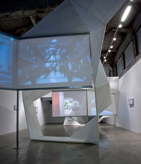
Gallery Space: Progress Shot


Gallery Space: Progress Shot


Gallery Space: Progress Shot


sketchup march30 third copy 3 cyborg portruding top non portruding top studios smaller~.skp (application/x-koan) 617K
The structure may still be too busy?

More still needs to be planned such as flow of space, natural lighting, and more importantly, the stairs!!

Gallery Space: Progress Shots


Bottom spaces for studios, the inverted pyramid for the gallery. Needs to be simplified and spaces allocated to designers.

9.4.10

Gallery Space: Progress Shot


Now it's turned into a kind of building for cyborgs. Is it too...busy? The colour is...not as nice as the transparency but I'd prefer it to be made out of concrete because its a nice contrast.

Bottom: And that same building five hours later...

Gallery Space: Progress Shot


I must say this trial has deviated a lot from the original, and I fear it has lost that kind of floating crystalline feel it had before. For this one, I was thinking of having 5 levels of galley space-but who would want to walk up 5 levels for only two artists, when each space was so small?? Dismal. Must rework. I shall go back to the original and was thinking of using that as a small gallery space, only I wasn't sure if our building was allowed to have a building foundation of a needle's width. I'm going to focus the underground as the artist's studio.

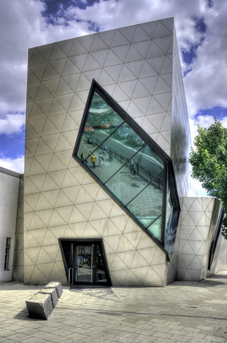
Daniel Libeskind: Jewish Museum

INSPIRATION: Rem Koolhaas_Casa da Musica


http://interwebbiz.blogspot.com/2008/01/wonders-hall-of-world.html accessed 08.04.10
http://images.businessweek.com/ss/07/09/0926_wow_concerthalls2/image/8_porto.jpg accessed 08.04.10

Rem Koolhaas also has some interesting architecture. I like his play on light also, which inform the colour. Although his interiors are a little more complicated with ceilings going in different angles, confusing for my eyes.

Courtesy of Yuliya's web find.

INSPIRATION: Daniel Libeskind


6.4.10

Chosen sketch model: fractured and globular.


I have chosen this one to further develop.
Above Ground: Goodwin. Fractured.
Below Ground: Swallow. Globular.

23.3.10

Inspirational Gallery Space


Images from http://www.wisaa.com/wp-content/architecture/Sapphire-Gallery-Design-Modern-Residential-Gallery.jpg
http://f00.inventorspot.com/images/museum-of-arts-and-design-i.img_assist_custom.jpg
http://static.dezeen.com/uploads/2009/11/dzn_Blow-x-Blow-by-Deegan-Day-Design-121.jpg
http://sinkingcities.com/wp-content/bxb4-399x600.jpg

These images are inspiring because of its use of materials and the angled ceilings which is similar to the design I am currently drawing up in sketchup. Its nice to see the shapes inform from the inside. Also an interesting use of light, which suggests a line which can also be used for my design.

14.3.10

Armando on Couture Techniques Week 2 Autumn 2010

Dear Students,
Following yesterdays lecture, i have attached some links for some video's which i thought were interesting for you! they are'nt long so please view them! They are all worth looking at! you may have to copy and paste them into another window to view them!

short clip on channel's couture process, with shots of how the make the toiles and embroideries
http://www.youtube.com/watch?v=8nN3ZXPNPx0&feature=related

a short clip on daphne guiness, how she styles herself and her aproach to fashion
http://www.youtube.com/watch?v=i9TPFSS6dSE&feature=channel

the short film which daphne guiness produced for her perfume in collaboration with comme des garcons- shows she is working with different artists and the fashion/art aproach she has
http://www.youtube.com/watch?v=Tpzq6RXxp1Y&NR=1

a short clip on daphne guiness, showing some of her couture collection, why she is so absorbed within the world and her family connections to couture
http://www.youtube.com/watch?v=elEuDqrX1fo&feature=related


I spoke with IT and hopefully we will be able to watch films etc during our lecture in the future!
regards
Armando

8.3.10

Original Photograph


ORIGINAL PHOTOGRAPH OF SOMETHING BEAUTIFUL:
SUBURBAN NIGHT SCENE, BEIJING, TAKEN DEC 2009

This photo was taken haphazardly as we rushed through the back streets of Beijing to see the Watercube before the gates closed at 10pm. The subdued colours and blurred focus beautifully captures an unintended ethereal quality drawing to mind the memory I had of walking through pitch dark whilst cars buzzed nearby.

Frank Gehry


Image from: http://ginman5.wordpress.com/2008/10/02/the-rest-of-summer-what-hasnt-been-happening/

FAVOURITE ARCHITECTURE:
FRANK GEHRY'S EXPERIENCE MUSIC PROJECT, SEATTLE

I am drawn to the fluidity of form and the striking use of colour Gehry created through his innovative use of new materials. The building works well for its purpose, instilling a sense of wonder and joy for those who have the pleasure to see it. His design is imaginative, unique and characteristic.

4.3.10

Richard Goodwin: Destruction. Transform. Fractured.


Image from: http://www.publishedart.com.au/bookshop.html?book_id=2469

NOUN. VERB. ADJECTIVE.
Destruction. Transform. Fractured.

3.3.10

Ricky Swallow: Impression. Imprint. Globular.


Ricky Swallow, Come Together, 2002, laminated jelutong, 66x63.5x81 cm
Image from: http://eladarmon.wordpress.com/2009/03/14/הערה-על-גולגולות/

NOUN. VERB. ADJECTIVE.
Impression. Imprint. Globular.

Patricia Piccinini


The Young Family 2002-03, silicone, acrylic, human hair, leather, timber 80.0cm x 110.0cm

Image from http://underwear.livejournal.com/tag/ar

NOUN. VERB. ADJECTIVE.
Aesthetics. Touch. Human.

Here is a good critic of her work by Jacqueline Millner:
http://www.patriciapiccinini.net/essay.php?id=4

LinkWithin

Related Posts Plugin for WordPress, Blogger...