1.4.11

Label Booklet: The Process


Using Indesign (because I couldn't figure out how to put page numbers into illustrator files)


http://desktoppub.about.com/od/indesigntutorials/ss/id_docarea.htm
Tutorials 
http://livedocs.adobe.com/en_US/InDesign/5.0/help.html?content=WSa285fff53dea4f8617383751001ea8cb3f-6e27.html
Video
http://www.adobe.com/designcenter/video_workshop/?id=vid0217


Space Envisioned

Initially a small boutique in Sydney's Paddington, then growing into a company with lots of staff but maintaining its intimacy and connections with customers. Modelled on the success of sass and bide store designs, the company will sustain a relaxed image and an effortless design ethos.
Retail spaces will be designed by Kelvin Ho, a Sydney based architect who works with fashion retail architecture. It will be fresh, sensitive and functional.
Staff will be intelligent, socially aware with a great understanding of design in general. Really friendly and will sustain a close-knit customer base. Operations similar to country road with loyalty cards and the authenticity of a large company with the intimacy of personal service and exclusivity. Prices are higher than average income, reflecting in a small-tuned-in creative community. However branding and marketing will make it coveted amongst them, i.e like Opening Ceremony.

STORE ARTWORKS
TINE is a fresh art influenced label, the store will feature largely non-fashion decorations, setting garments as skilled artistry clothing rather than trend focused. Reflects brand value of sustainable fashion and considered design. Herald many philosophies from art, design etc. (cultural and social movements). Commissioned artists and designers. Keep it current and forward thinking.
Store artwork. Upon entering. Reminds me of The Victorian Romantics and ideals of liberty, etc. 
Relates to contemporary society with individuals enjoying more freedom of expression enabled by technology, democracy, emancipation etc.
Artwork by  By katie de bruycker
☆

Bill Henson. MY absolute dream! Hang a Bill Henson artwork.

Store hanging artwork.

EF - Live The Language - Paris from Albin Holmqvist on Vimeo.

An example of the store video aesthetic. Cosmopolitan, located within society; social. Blurry sensual imagery. Commissioned artists and designers.

GARMENT DISPLAY
Garment display will 'hang' on the walls. Like a museum display, these garments presented on strings or placed against a white wall backdrop. Re-signifies function of clothing, it is not just utilitarian but make it prized and coveted. Communicates brand identity as different, conceptual and having exquisite quality of make an attention to detail. 

Jean Prouvé's bicycle. Store design has object references to art, architectural history. Items hanging. Hang garments .

Inspiration for the display of garments. Like a museum or gallery catalogue. Garments worthy of scrutiny, but also prized.

RETAIL DESIGN
Retail design reflects brand identity of being open and free. Transparent, austere, modest. Draws reference to Adolf Loos' modernist architecture, unadorned and essential. Focus shifts from ornament to a consideration of lines, shades, proportions which underpins garment design values. Against a minimalist backdrop, colour and placement of furniture as well as plenty of natural lighting is used to create intimacy and connection with the customers as well as reflect social awareness with a green energy building. The store design will be an amalgamy of the following images extended across various stores across australia. 

Rough store design. I like the open space and fresh clean colour scheme. Would like it to be more white, spacious, exposed. i like the emphasis on the floor as a symbolic entity. Architecture supports label identity as austere, stark, modest and essential. Removal of barriers. Engages a customer experience as informal, like you're coming into someone's home. Customer counter is small, but plenty of seating space. Very relaxed. Probably a smaller space.

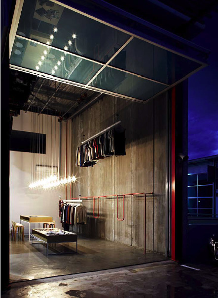
Store design may be in a backstreet location, 'unfashion location' Uphold label philosophy as unusual, surprising and forward thinking. Structuralist sentiments, showing the construction by using concrete walls (reflects garment design as reflexive and exposed. Takes inspiration from architectural history of the deconstructionists, or critical regionalism. Garments have to speak back to the customer)


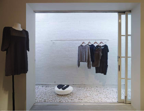
Store design inspiration: Relating outside and inside as cohesive entities, communicates the brand as spiritual, connected, extension. My store has to have a backyard/courtyard. Further communicating homely aspect of store design, intimate and personal. 


Store design inspiration: lots of mirrors and clean aesthetic. Use this idea of store layout composition to give a sense of depth and light. Referenced philosophical enlightenment, would prefer natural lighting but this is an example of good use of white walls. Probably great spaciousness preferred and a link between garment display and store circulation. Good use of black carpet. The colour scheme is definitely reflective of TINE label store design. Creams, blacks, hint of earthy browns and would like the signature colour of pale yellow. 


Perhaps stark like this. Sensitive materiality, textures of white. Reflect label colours white, black grey and pale yellow. But inflused with creamier warm colours so it's inviting. 

Store design uses this kind of concrete window sill with plenty of natural lighting. 

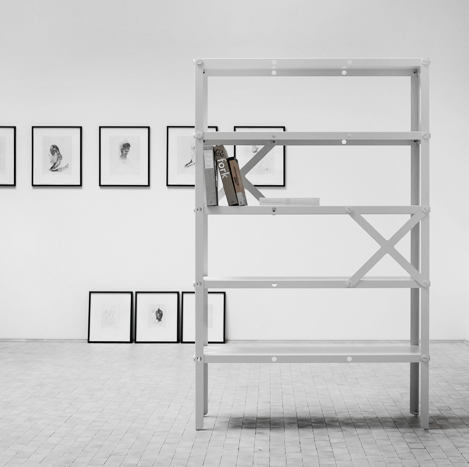
an example of the customer service desk I want. Stark modernist, yet bare and approachable. 


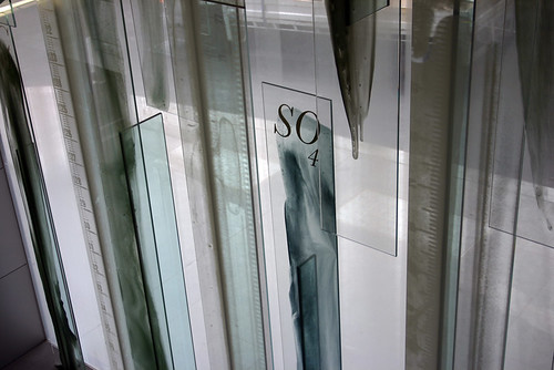
Janet Laurence 'water veil' artworks to communicate sense of peace and environment. Use real running water on top of artwork. References alchemy and science, perpetuating label identity of intellectual and historical.


31.3.11

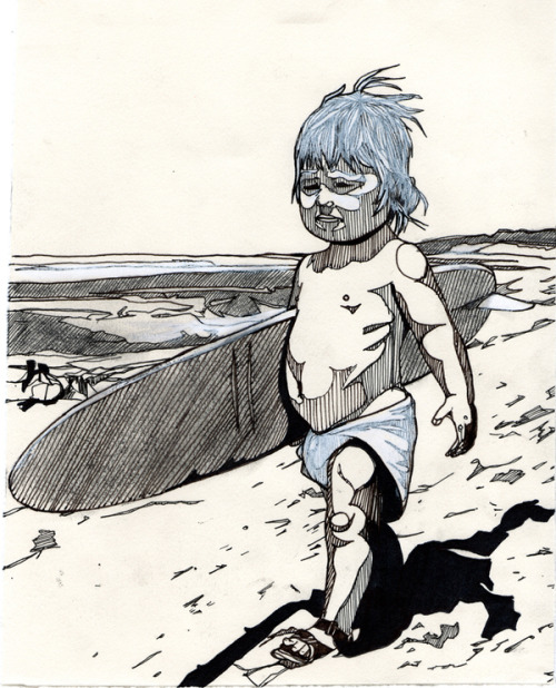
Luke Dixon

http://www.behance.net/gallery/Drawing-and-Prints-2009/256704


Luke Dixon

http://www.behance.net/gallery/Drawing-and-Prints-2009/256704


MAXIMS SPEAK LOUDER THAN WORDS: Maxims I like (And the label likes)

Stop dreaming. Start doing.

Good artists copy, great artists steal.

In this day and age, everyone likes everything simple and easy (own idea)

We all have to be different in the same way (own idea)

Really awesome magazine design

http://www.behance.net/gallery/dale-magazine/361217

Print promotion material: Nudie Jeans Co.

http://issuu.com/nudiejeans/docs/nudiejeans_collectionbook_ss11/6?mode=embed&layout=http%3A//skin.issuu.com/v/dark/layout.xml

Nudie Jeans Co. has really good print promotional material that infuses a sense of personality and heritage into their jeans. I chose to study their example because it is a relative newcomer to the market as opposed to levi's which has already become a sign brand.
Some notes:
-personalisation of their jeans, use of colloquial language and terms of endearment to describe the jeans as 'belonging'. Almost like a part of you. Befriending the jeans. Hangtags, booklets describing your product. 'The smell of a new pair of dry selvage jeans', 'mourn your worn out jeans'.
-displaying jeans, as a coveted item, an object worth admiration in a gallery or like a museum catalogue. As living art, shown and worn. Descriptions of details and seams to elevate their product to craftsmanship or each pair to be designed with love and care/. 'passionate about denim', 'dry' is highly sensual adjective, also used to describe alcohol. Taps into whats 'cool'. 'second skin' 'collectors edition', 'dedicated designers'. names countries, worldwide and international. 'fabric from Japan' uses places to signify exclusivity or exoticism. Or cosmopolitan. 'trims made exclusively for the range' 'skilled washers'
-product diagrams, sartorial jargon for the knowledgeable consumer, taps into the contemporary market of  fashion aware customers and greater expectations for their products. The clothes are like a loyal friend. Close connection/forms bond with product. 'harvest cotton', 'indigo rope dyeing', 'shuttle loom'
-suitable graphic design. dds-simplicity. trendy graphics, references to literature. intelligent and current.
-locating the brand within society. i.e culturally aware. it is social, joins amnesty international to promote human rights. 
-information on how they are made: transparency but also closer relationships. Sense of heritage and longevitity. Conveys the brand as a good investment. 
-Strong philosophy=strong identity=greater bond. 
-handwritten fonts is like personalisation. Which aims to break the sense of anonymity or machine production characterised by modernity.
-'the lab' appeals to guys and girls. Like the jeans are rooted in science, it is experimental, expressive yet,somehow correct and reliable, the product of knowledgeable people =trustworthy. 'selvage lab-vintage washes'
- similar jeans in a large range of colours. Again, consumers get a range of choices, percieved as value to get EXACTLY what suits them. But also feel specialised. Also for practical reasons, a quicker release of new items to keep it fresh, same design in different colours eliminates the need to come up with, test and produce new garments. Takes a pair of jeans they know have the right cuts and milks it for all its got. 
-pages designed like a dictionary or index, illusion of order, variety and that it has everything you need. 


29.3.11

Fashion Video inspiration: Vanessa Bruno


These videos provide inspiration to my own label. It is ethereal, feminine, contemporary quirky video style is self-reflexive. Use of diagetic sound via subject interacting with the camera and visual effects as the subject moves in rhythm to the music. Cutting and editing is used for effect.
This is the kind of video representing my label but with brighter colour like in the Antipodium video. Use contemporary upbeat/electronica music.

Positioning Statement

This picture perfectly captures what the label is about. So inspiring. 

TINE  is an edgy, contemporary womenswear ready-to-wear brand by Christine Pan. Targeted towards 24 year old women, it's aim is to create different yet coveted casual and businesswear garments whilst remaining commercially viable within Australia and hopefully internationally within 10 years time.

Forecast:
TINE the label is created to serve as a stand-alone brand 'to test the waters' with the intention to grow and become a multi-brand under the name of Christine Pan by which TINE will slowly become a diffusion label offering a similar aesthetic but to cheaper price points. Similar to Wayne by Wayne Cooper, the brand will be TINE by Christine Pan.

Adding value to the product: innovate and diversify. Unique products in fabric, colour and cut at a premium price. does not follow market trends but is mindful of its direction. Responds to contemporary fashion and in touch with the lives of its target market. Main aim is to revitilise sales. Initially uses available fabrics sourced within Australia, China and embellishments from India but differentiates through colour and cut. Plans to develop own unique fabric prints and finishes in the next 5 years to keep up with current technologies in textile product. Forward thinking.
Quality and eco-aware product: style, durability, comfort. colour-fast and eco-friendly dyes. Minimal waste-cutting. emphasis on exclusivity, sells small runs at higher price points. Targeted towards wealthy clients. Finishes must be durable during the fabric finishing process; stable in the presence of other chemicals; wash-fast; and evenly and consistently applied. Finishes also need to be financially feasible and environmentally friendly.  Leathers, silks, natural fibres, synthetics.
Business side: eliminate the middle-man. No sweatshop workers, fair pay workers. Better conditions for workers.
Advertising: web, print. word of mouth.

References: To convey a sense of heritage longevity, imagery from vin

Personality: humble. modest about it's own talents. no pressure to conform but doesn't scream individuality or difference for the sake of being different. It is balanced and suitable. It has attention to detail, conceptual undertones, self-aware and is commanding because of it.

Analyse and explore personal brand.


What kinds of design are you interested in pursuing and why? Womenswear and menswear. Initially womenswear with plans to move into menswear to potentially develop it in equal parts. Why? There is much scope for design in both mens and womenswear. It will become a fully fledged brand but grown organically. Perhaps will show at runways but prefer to develop it outside the public sphere. Want to look to brands like Country Road or Antipodium which was built on their current customer base, clothes which addressed the needs of their target market and clever marketing. 


Inspiration: Katie Dean


http://www.theloop.com.au/app/people/portfolio/KatieDean

27.3.11

Name

akirs
aris
christine pan
chrisp
chrins
lee finch
oliver henson
hassin
unison
misnomer
chrissy lock
c / pan
c.j.pan
c.j.p
c.pan
Christine P
tine (Chris-tine/deer antlers, Y shape)

tine  (taɪn) [Click for IPA pronunciation guide]
 
— n
1.a slender prong, esp of a fork
2.any of the sharp terminal branches of a deer's antler

LinkWithin

Related Posts Plugin for WordPress, Blogger...