6.9.10

Development of Concept

I found that my previous theme was rather limiting, if I were to only use black ink as it give this elusive transcient nature of the black ink, however i found it difficult to interpret that into any distinct embellishment idea. So I decided to research further into how I can use this idea of ink movements into a concept which can be more easier to work with. I chose Janet Laurences artworks as indicative of representing 'luxuriant nature' as it depicts and manipulates aspects of nature and combines them with the fluid movement of ink on perspect. I responded positively to this concept as it has this transcient quality as well as having interesting textures and graphic details which can be more easily interpreted into an embellishment. Below are some images to use for my concept board:

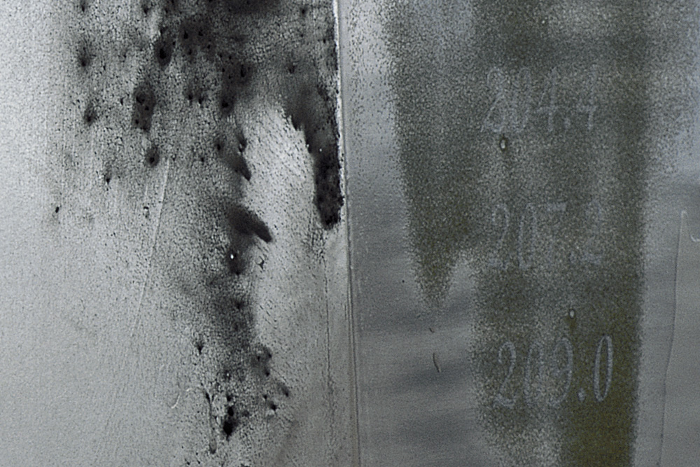
This is a really good image for surface manipulation, I was thinking of translating this into an ink-dye technique which could relate to the shibori technique we were taught. I quite like the idea of turning the conventional use of luxuriant beading using crystals and white beads on fabric which is marred or raw to emphasise this contrast.

The leaf in the far right is particularly interested as it has this delicate nature so I could use white tulle or silk georgette and run some stitches along it which creates some contrast and interest.

I quite like the colour and the raw nature but not sure how I'm going to interpret that as yet.

Janet Laurence uses image from architecture which provides structure and graphic interest to her artworks. I quite like the rigid lines and sense of proportion alluded in this artwork, the colour palette is not quite what i was looking for as i'm interested in an all white look.

However this picture has really nice contrast and the use of circles illuminating the space is really interesting. Once again I like this idea of transcience of the light and the mood that it sets.

This image has more of a reference to nature, and I like the mix of the green and the jelly fish looking blog at the top. This is quite abstract and could be interesting to interpret.

Architectural images once again but it focuses on the layering aspect of the ink and the solid lines. I really like the contrast so I might layer my fabrics.

This could be interesting in how I dye my fabric, I may tie it into geometric knot. I will need to experiment, not sure how this will turn out.

I really like the vertical lines in this picture which is strong but not dominating. The colours are a little but subdued and dark so not sure if I wanted to go with that. But the red if certainly interesting.

This image gives me the idea of having lettering in my embellishment.
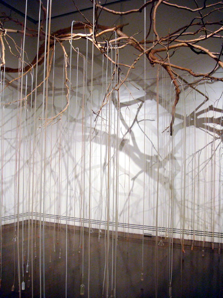
The string are really beautiful as well as the branches, I may want to really focus on this aspect.

The geometric and repetitive black lines are interesting. But not too appealing at this stage.

Use of the poles, again I may incorporate this somehow. But what appealed to me in this picture was the mist, which really give it an atmosphere which I might interpret as white tulle giving it volume

The plants in the picture might be nice as applique. And maybe I could print the fabric and offset it as she has done in this artwork.
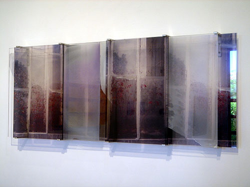
The speckled red is really nice in this artwork. The colours work well too like a layering of images. I'd probably interpret that as matt red beading or pom poms.

I love this picture, its got to be my favourite. The branches are really dominating and gives it a character. This looks very raw and nature-like so I might print the picture or dye the fabric.

Precious to Punk embroidery-The theme

For this project I will be working with the theme "luxuriant nature" inspired by my aesthetic of refined yet comtemporary embellishments. I am aiming to blend shear and solid fabrics with surface manipulations and playing with contrasts. I am inspired by the luxurious and intense use of beading and embroidery in the works of Christian Lacroix which I have selected images which reflect his bold extravagent use of embellishments. On the other hand, I am also inspired by the refined yet delicate use of fabric and embellishments used by elie saab. I chose also to research Jean-Paul Gaultier because of his strong and unconventional use of beading and found objects as embellishments.

When deciding on my concept I took the idea of "luxuriant nature" beginning with the idea of flowers which led on the idea of soft floating nature of black ink, sinking within water as representative of the wonderful science of ink experiments subdued to the laws of nature. Here are some preliminary images for the concept board:


Inspiration

Elie Saab

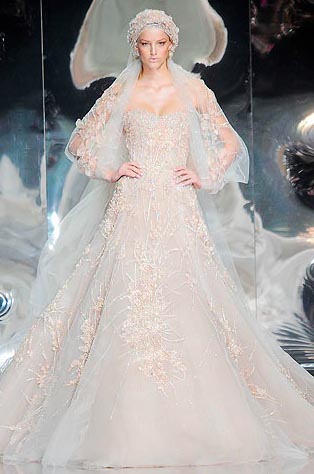
Elie Saab has such beautiful beadwork. I am inspired by her feminine use of tulles and beading and there are lots of references to the floral which links to my theme of luxuriant nature. There are many techniques used here with the crystal beading as well as the use of 'rivers and valleys' on the front of a dress which gives me the idea of manipulating fabric for placement right in front of a garment. They combine tulle with lace and often overlays it with beading. I've taken inspiration from the circles placed on a garment and may interpret that into my own.


Jean-Paul Gaultier

I love his use of fabric in an unconventional way, gathering the soft tulles with lace and threads, its like he cocoons the body . Meanwhile his use of beading is creative, playing with the soft nude fabric and skin and almost 'tattooing' patterns on the body in the form of beads. His use of red beads challanges the conventional use of clear or crystal beads but still allowing the feel of fragility and balance. Additonally, the use of cross-over black threads to form a pattern is interesting as well as his choice of placing it at the waist. Very sophisticated and refined design decision complemented by her headdress.


Christian Lacroix


This designer uses beautiful lacework and beads directly onto the lace itself. None of the colours are too dominating and the beads create this soft dominance, accentuating various parts of the body, here again it is flowy and detailed. Despite it looking quite simple, the bead work is intensely elaborate but not placed all over the garment.


LinkWithin

Related Posts Plugin for WordPress, Blogger...