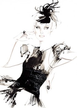
antonio lopez decoy magazine
31.3.12
30.3.12
Illustrator: artaksiniya
All images from artaksiniya's portfolio http://artaksiniya.com/Illustrations/index3.html
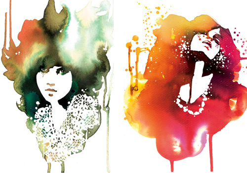
I saw this illustrator through Decoy Magazine. I've included a few of my favourites (and there are a lot because the work is so polished and dynamic). The signature feature would be the tiny vertical hatching lines which make up the shadowing of the figure as well as the strong composition in the works. Some of them have strong references, in my opinion, to the fashion illustrations of the 1920s and 30s and it really shows how referencing illustrations of the past can still work in a contemporary way. Another key technique is the patterns placed side by side, for the garments and background as well as line and direction to create interest.
 |
| this one's my favourite. I've never seen a contemporary artist reference historical fashion illustration in this way. |
 |
| I also like this one because of the dynamic composition and used of colour. |
A SIMPLE TECHNIQUE...
Isn't this amazing? It's a great example of how colour and proportion can give so much information. This is playful, suggestive. You can understand it straight away without explanation...
29.3.12
Muse Research
Michelle (Shelly) Rosenberg
Age: 24
Profession: artist/model
Shelly Rosenberg is at the peak of her youth. She loves to travel to far off exotic places with bright colours and a vibrant culture. She wonders the land on foot, by train, in gondolas, tuk tuks and rickshaws savouring the vast smells and sights of new cultures. She loves to experience new things and basks in the beauty of all things natural, sweet and artistic. She carries a watercolour set everywhere she goes and even likes to develop new colours from sourcing minerals on her trips. She is independent, free spirited and vivacious.
research
28.3.12
Mentors: Stina Persson and David Downton research
What for you makes a successful fashion illustration?
Fluidity, mastery of the medium - capturing a sense of the moment, layout and use of space and most important of all, strong drawing. You can't be too good at drawing.
BIO:
David Downton is a well known fashion illustrator who draws from couture shows and the portraits of female celebrities such as Erin O’Connor, Linda Evangelista, Carmen Dell'Orefice, and Dita Von Teese <http://www.daviddownton.com/biography.html>. He has illustrated for many commercial projects like Tiffany & Co, Bloomingdales, Chanel, Dior, Vogue, Harper’s Bazaar, and the V&A Museum; and in 1998 Downton launched the first ever journal of Fashion Illustration, Pourquoi Pas? <<http://www.pqpmagazine.com/> David Downton has a BA hons illustration/graphics and is a visiting Professor at London College of Fashion. In April 2009 received an honory doctorate from the Academy of Art University, SanFrancisco.<http://www.daviddownton.com/biography.html> Celebrated model and portrait sitter, Carmen Dell’Orefice comments “David is foremost a gentleman. He is a disciplined romantic with a unique ability to capture the essence of his subjects.” (Downton, 2010)
Downton's career as a fashion illustrator came gradually- first from being a commercial illustrator, over a period of 15 years whilst he was illustrating for a variety of books, advertising and packaging, until he was commissioned to draw the Paris Haute Couture shows for a magazine in 1996. His style of drawing attracted the commisions of fashion images.
CREATIVE PROCESS AND METHODOLOGY:
David Downton makes the distinction between good fashion and good fashion illustrations and how one can be translated into another. One of the most important things is the 'sense of body in the clothes. After that, proportion, colour, a detail.'<http://www.daviddownton.com/interview.html>His lavish and feminine illustrations are usually drawn from photographs -or live models if it is portraiture- and is influenced or appreciative of fashion illustrators: 'Gruau for his graphic genius, Vertes for his humour, Bouché for his lightness of touch and Eric for his draughtsmanship'.<http://www.daviddownton.com/interview.html>
WHAT PARTICULAR TECHNIQUES HAVE THEY DEVELOPED THROUGH THEIR WORK?
Downton's medium of choice is watercolour or gouache when applied over small areas. to obtain more 'flat saturated colour[s]' he uses paper collage with an acetate overlay of lines and shades drawn using black indian ink. <http://www.daviddownton.com/interview.html> What makes downton's artworks unique are this realistic yet expressive renderings of the subject, simplicity and effortlessness, use of fluid line, and sometimes the scratchy dry brush detail. His drawings are spontaneous, free and expressive. Downton's signature illustration style feature delicate lines and a elimination of detail. He describes the working process towards achieving this as:
the hardest and the most interesting thing. In order to leave something out, first you have to put it in, or at least understand how every thing works. I do dozens of drawings on to layout paper taking the best from each one as I go. When the drawing looks right I start to eliminate, to de-construct if you like. I keep working until it looks spontaneous.' <http://www.daviddownton.com/interview.html>
His fashion illustrations aim to convery a 'controlled spontaneity' (Downton, 2010) In the process of obtaining this spontaneity in drawing, Downton does dozens of drawing before he arrives at one ideal drawing which looks effortless.
HOW IT INFORMS MY WORK:
I greatly admire David Downton's work for its look of sheer effortlessness, the simplicity of lines, the mark-making of only the most essential. In particular, I am drawn to his ability to achieve incredible likeness to his subjects, no doubt will encourage me to study more portrait drawing. Another aspect that will inform my work is the way he uses watercolour by contrasting the smooth brushstrokes against rough, dry ones. His colour palette is soft, light and tinted, which contributes to the overall dreamy and feminine feel of his drawings. The women in the pictures are always luxurious and graceful, through posture perhaps but always drawn with particular attention to the expression of the eyes.
References:
, Pourquoi Pas?, <http://www.pqpmagazine.com/>
David Downton Biography<http://www.daviddownton.com/biography.html>
Glenville, Tony, David Downton, <http://www.daviddownton.com/interview.html>
Downton, David., 2010, 'David Downton Interviewed by Tony Genville'Masters of Fashion Illustration, Lawrence King Publishing, London.
24.3.12
Antlers for Tine
21.3.12
20.3.12
Mentors
Bernard Arnault
French business magnate who is best known as the chairman and chief executive of luxury group LVMH.Naomi Milgrom:
head of sussan group
collette dinnigan
Richard Branson
15.3.12
14.3.12
1. Style/Aesthetic
____________________________________
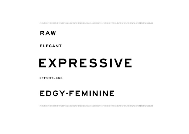
Raw
elegant
edgy-feminine
romantic
expressive
____________________________________
Initial Words...
1.3.12
Subscribe to:
Comments (Atom)


+rosenberg+portrait_web.jpg)


