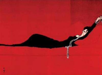
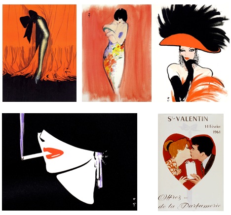
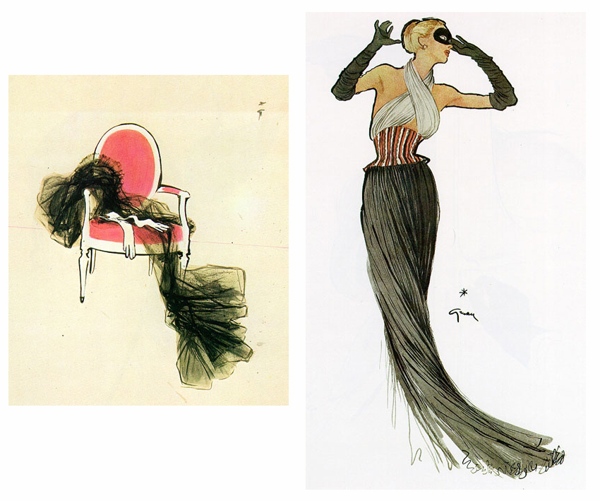
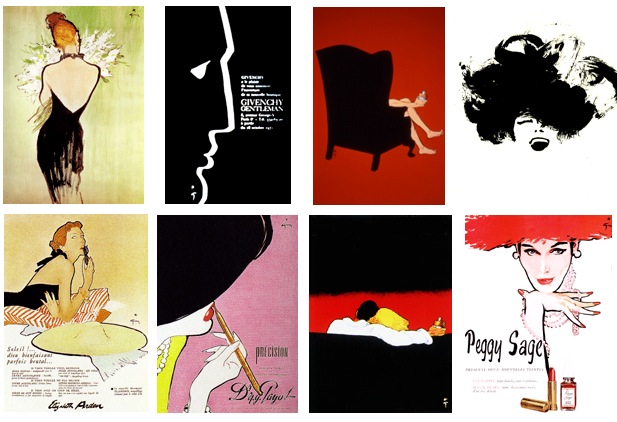
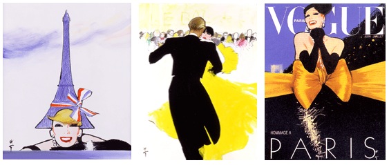
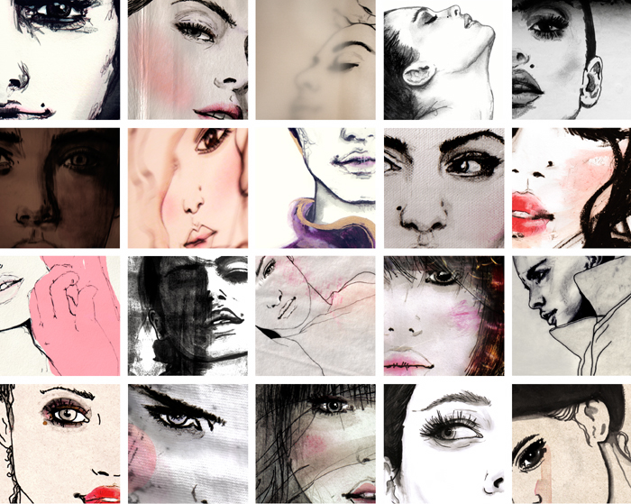
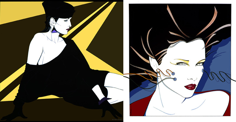
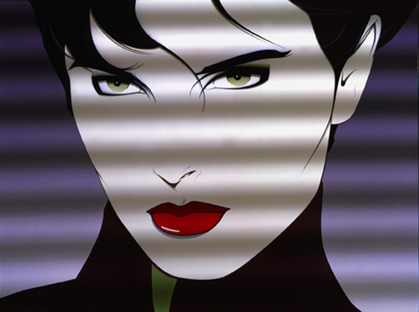
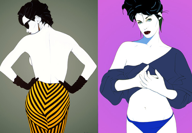
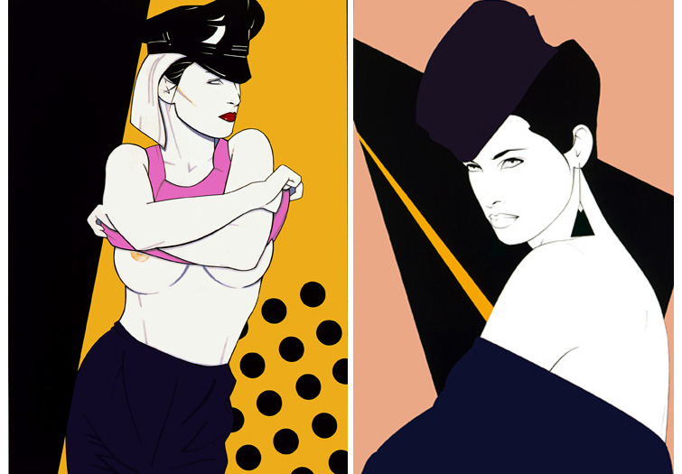
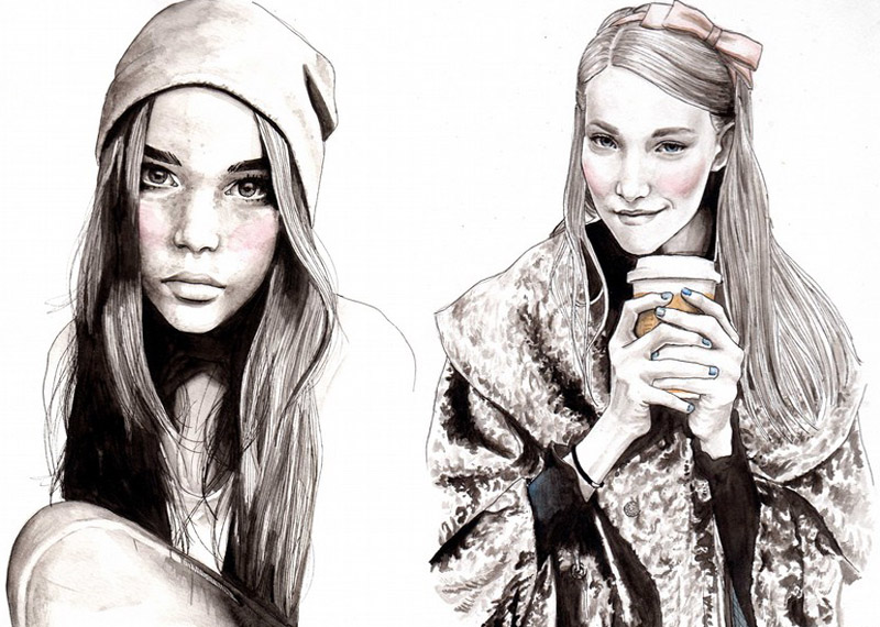
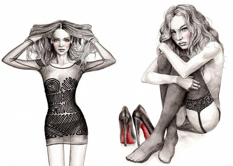
Images from http://coolechicstylefashion.blogspot.com/2009/06/amelie-hegardt-fashion-illustrations.html
Quite interesting watercolours, I still like Stina Persson a bit better though, the use of medium is very expressive although the drawings could be better.
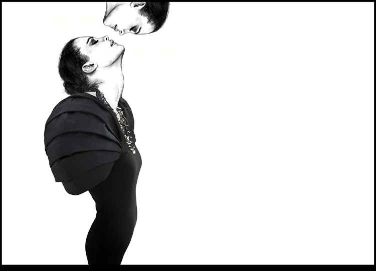
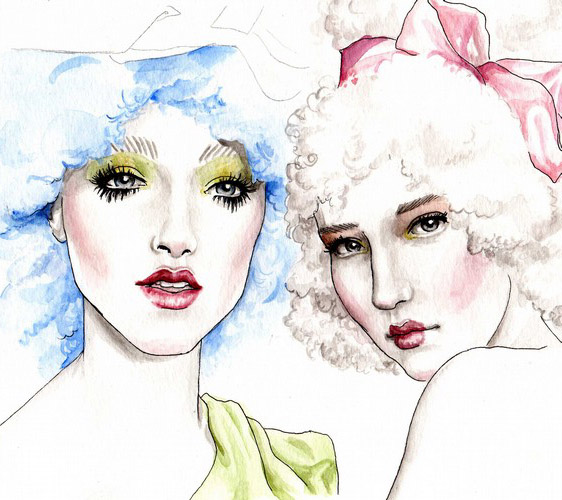
Oh yay, found another interesting fashion illustrator. She studied industrial design before teaching herself fashion and is now designer for reebok. Cool huh? Just goes to show people in design can cross-over.
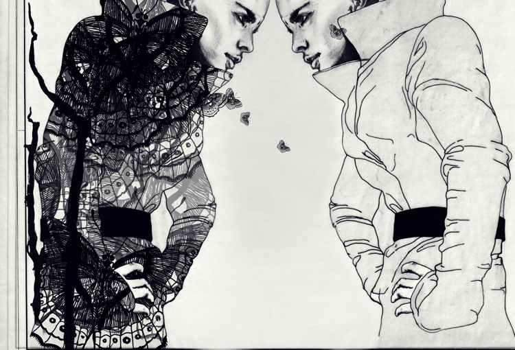
Above: This is an experiment which I had wanted to attach underneath the tulle since the fabric blends in nicely with the lace colour. Its aim was to create these flower buds which gave it a more 'nature feel' but it ended up being too bulky and didn't blend in as nicely. Otherwise I would have been nice to have the wooden beads underneath the tulle too... Some of the sample combined into a practise geometry. Initially I wanted to have holes put into the hem of the garment as remnants of the cirlces placed into the tulle but I didn't know how to resolve the look, it was too messy so I decided to cut it off in order to neaten it up. The result turned out well as it forced me to think about an asymmetrical hemline. I was initially thinking of hand binding it or placing beads around it... The string of beads work well with the beads in the bodice. This was a happy accident as well. I was attempting to sew the two pieces together as the front of the dress when I accidently sewed the tulle on backwards! But when I flipped it over the look was so much more refined as it hid the edge of the fabrics and you could still see some of the beads showing through! These beads were meant to reference the tiny specks of light at the left of the mood board, underneath the black smoke. The concept was again to have a lightness and the black string underneath is a design feature. The vertical clear beads were inspired by the center left picture of the strings hanging from the branches. It forms a link between the two pieces and creates a greater sense of fragility. The finished product=the front of a dress. I'm happy with it because it has a lightness and delicate feel to it. It's meant to be inspired by Janet Laurence's artworks and the shibori looking manipulation is an abstract reference to floral.
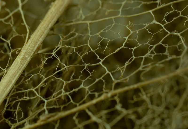
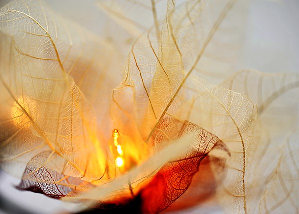
So adding to this was the idea of the leaf skeleton. I am particularly drawn to the shape and fragility of the leaves. I thought about making a sort of lace like surface manipulation.