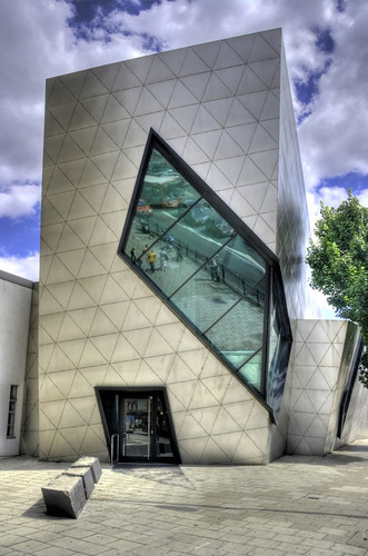
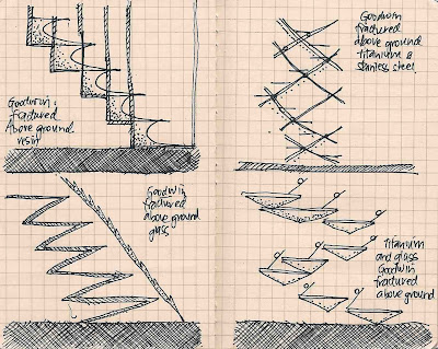
27.4.10
Lecture Slide
The Camera Obscura:
Latin for 'dark room', this optical device can project an image onto paper and traced. Mirrors make it possible to project the image right side up. It is mainly a box with a pin hole which controls the amount of light. (wikipedia)
This could relate to my design in terms of channelling light and the way it controls perspective. The camera obscura design itself suggests an enclosed space with a thin beam of light which cuts through the room.
24.4.10
Stephen Hawking quote
Steven Hawking:
“All the evidence shows that God was actually quite a gambler, and the universe is a great casino, where dice are thrown, and roulette wheels spin on every occasion”
“Not only does God play dice, but... he sometimes throws them where they cannot be seen.”
"Time and space are finite in extent, but they don't have any boundary or edge. They would be like the surface of the earth, but with two more dimensions."
— Stephen W. Hawking (Black Holes and Baby Universes and Other Essays)
"One could say: "The boundary condition of the universe is that it has no boundary." The universe would be completely self-contained and not affected by anything outside itself. It would neither be created nor destroyed. It would just BE."
21.4.10
Final animations: Perspective, Sections, Textures
Lecture notes.
Crysis Wars:
Align snap and align object.
Series of screen shots at different times of day, fraps software.
entity-> lights-> diffuse multiplier--> cast shadow. if i highlight axis and press ctrl+c it creates another light. you can change the colour of the light using the menu on the left. well placed lights can create nice atmospheres and spaces. the way light interacts with surfaces.
For next tute: select one image from the slideshow and use it to reflect on a component of my design. write 150 words that clearly summarises this.
works:
The black box: colours and temperatures, shadow conditions, the shadow as a refuge, disconnected shadow(vampire), as repetition and space between shadows. pentimento technique: drawing something and painting over it. transistence of the shadow in art history, camera obscura. Theoretical background on the work: analogy of the cave: Plato. Camera Obscura: defraction and diffusion . the invention of drawing: notion of shadow being connected to drawing-mythology.
the shadow as threshold. steven holl drawings "written..." her drawing was a hybrid of the different views. drawing on vallum.
12.4.10
Note
Hi Maryam,
Please refer to your email regarding the animations and google warehouse. I had terrible trouble uploading them and will keep trying.
11.4.10
Final Model: Showing artists in gallery space
Final Model: Showing artists in studios
Ricky Swallow studio space.
Below ground.
Texture: Flow
Richard Goodwin studio space.
Below Ground.
Texture: Bendy
10.4.10
Gallery Space: Progress Shot
sketchup march30 third copy 3 cyborg portruding top non portruding top studios smaller~.skp (application/x-koan) 617K
The structure may still be too busy?
More still needs to be planned such as flow of space, natural lighting, and more importantly, the stairs!!
Gallery Space: Progress Shots
Bottom spaces for studios, the inverted pyramid for the gallery. Needs to be simplified and spaces allocated to designers.
9.4.10
Gallery Space: Progress Shot
Now it's turned into a kind of building for cyborgs. Is it too...busy? The colour is...not as nice as the transparency but I'd prefer it to be made out of concrete because its a nice contrast.
Bottom: And that same building five hours later...
Gallery Space: Progress Shot
I must say this trial has deviated a lot from the original, and I fear it has lost that kind of floating crystalline feel it had before. For this one, I was thinking of having 5 levels of galley space-but who would want to walk up 5 levels for only two artists, when each space was so small?? Dismal. Must rework. I shall go back to the original and was thinking of using that as a small gallery space, only I wasn't sure if our building was allowed to have a building foundation of a needle's width. I'm going to focus the underground as the artist's studio.
INSPIRATION: Rem Koolhaas_Casa da Musica
http://interwebbiz.blogspot.com/2008/01/wonders-hall-of-world.html accessed 08.04.10
http://images.businessweek.com/ss/07/09/0926_wow_concerthalls2/image/8_porto.jpg accessed 08.04.10
Rem Koolhaas also has some interesting architecture. I like his play on light also, which inform the colour. Although his interiors are a little more complicated with ceilings going in different angles, confusing for my eyes.
Courtesy of Yuliya's web find.
8.4.10
Sketchup model with stair design.
7.4.10
Subscribe to:
Posts (Atom)