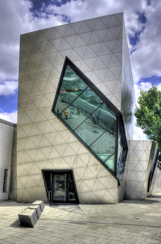


"The Felix Nussbaum Museum" http://box.plotcad.it/public/post/daniel-libeskind-felix-nussbaum-museum---osnabrueck-germania-183.asp
http://farm3.static.flickr.com/2658/3787773459_397da8ee42.jpg
http://box.plotcad.it/public/daniel_libeskind_felix_10.jpg
"The Villa" http://jetsongreen.typepad.com/.a/6a00d8341c67ce53ef011571185981970b-500wi accessed 08.04.10https://blogger.googleusercontent.com/img/b/R29vZ2xl/AVvXsEhP4heTw7dXKX4AjTvZ0HANh0_9wqVvSNj35s0v-LEYDnEFugFKjmTTYQt8y9lo9P9AWc2cq5OeRtjcyeD4PlNgNg3I0x0BqeXCTD0ZBpWLqzNhd1WNV6EJBCFSW01SwnOUfC64jJsR04U/s1600-h/daniel_libeskind_felix_1.jpg accessed 08.04.10
http://nymag.com/daily/intel/2007/04/17/17_libeskind_lg.jpg accessed 08.04.10
http://mallorcaphotoblog.files.wordpress.com/2008/05/libeskind_weil.jpg accessed 08.04.10
INSPIRATION
I came across Libeskind again on the internet, which made me realise that the sketches I've been doing remind me a lot of his architecture! Its eerie. Nevertheless, I find his architecture incredible intriguing and beautiful. His sensitivity to materials, and colour and LIGHT and all those DETAILS he puts into it so that it works well with the environment. The subtle contrasts between shapes! I LOVE LOVE LOVE! Sorry, just can't get over it.
So some of the ideas I can incorporate into my gallery space:
- the idea of an open gallery space, light, airy and subtle. Lines dictated by light. Look at the way Libeskind has used light, it shines onto the wall and ground due to his use of shapes aesthetically as well as functionally as a way of curbing light. I can incorporate this idea into my prism gallery, whether I should limit the amount of light to create shapes on the ground, or if I should make the entire walls light to 'open' the space.
-I like the idea of void in the bottom picture. It seems to frame the landscape and is like peering into a work or art itself, or peering into the world that the artist created for you.
-materiality. I was thinking titanium edges at first. But after considering the work of Libeskind, I should decide more carefully what properties in the building materials are able to afford, that is, Libeskind uses materials as a way of contrasting and further accentuating material types. Materials he uses: mirrored glass, titanium, wood, concrete.
The next thing I need to concentrate on, is creating the interiors, which I feel will be much more controllable if I didn't have completely glass walls. Its difficult to decide whether to have it as a big gallery since its shape is so unique and demanding presence, or whether it should be small, since its only got two artists' work in it.

No comments:
Post a Comment