Retail spaces will be designed by Kelvin Ho, a Sydney based architect who works with fashion retail architecture. It will be fresh, sensitive and functional.
Staff will be intelligent, socially aware with a great understanding of design in general. Really friendly and will sustain a close-knit customer base. Operations similar to country road with loyalty cards and the authenticity of a large company with the intimacy of personal service and exclusivity. Prices are higher than average income, reflecting in a small-tuned-in creative community. However branding and marketing will make it coveted amongst them, i.e like Opening Ceremony.
STORE ARTWORKS
TINE is a fresh art influenced label, the store will feature largely non-fashion decorations, setting garments as skilled artistry clothing rather than trend focused. Reflects brand value of sustainable fashion and considered design. Herald many philosophies from art, design etc. (cultural and social movements). Commissioned artists and designers. Keep it current and forward thinking.
Store artwork. Upon entering. Reminds me of The Victorian Romantics and ideals of liberty, etc.
Relates to contemporary society with individuals enjoying more freedom of expression enabled by technology, democracy, emancipation etc.
Artwork by By katie de bruycker
Bill Henson. MY absolute dream! Hang a Bill Henson artwork.
Store hanging artwork.
An example of the store video aesthetic. Cosmopolitan, located within society; social. Blurry sensual imagery. Commissioned artists and designers.
GARMENT DISPLAY
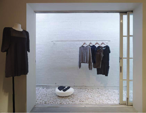
Garment display will 'hang' on the walls. Like a museum display, these garments presented on strings or placed against a white wall backdrop. Re-signifies function of clothing, it is not just utilitarian but make it prized and coveted. Communicates brand identity as different, conceptual and having exquisite quality of make an attention to detail.
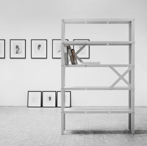
Jean Prouvé's bicycle. Store design has object references to art, architectural history. Items hanging. Hang garments .
Inspiration for the display of garments. Like a museum or gallery catalogue. Garments worthy of scrutiny, but also prized.
RETAIL DESIGN
Retail design reflects brand identity of being open and free. Transparent, austere, modest. Draws reference to Adolf Loos' modernist architecture, unadorned and essential. Focus shifts from ornament to a consideration of lines, shades, proportions which underpins garment design values. Against a minimalist backdrop, colour and placement of furniture as well as plenty of natural lighting is used to create intimacy and connection with the customers as well as reflect social awareness with a green energy building. The store design will be an amalgamy of the following images extended across various stores across australia.
Rough store design. I like the open space and fresh clean colour scheme. Would like it to be more white, spacious, exposed. i like the emphasis on the floor as a symbolic entity. Architecture supports label identity as austere, stark, modest and essential. Removal of barriers. Engages a customer experience as informal, like you're coming into someone's home. Customer counter is small, but plenty of seating space. Very relaxed. Probably a smaller space.
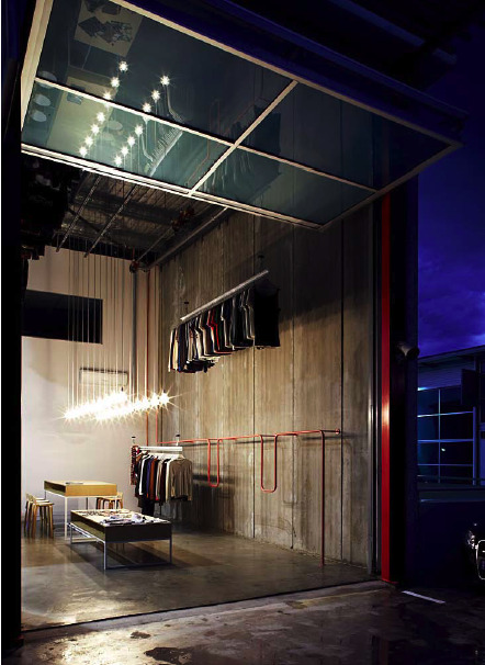
Store design may be in a backstreet location, 'unfashion location' Uphold label philosophy as unusual, surprising and forward thinking. Structuralist sentiments, showing the construction by using concrete walls (reflects garment design as reflexive and exposed. Takes inspiration from architectural history of the deconstructionists, or critical regionalism. Garments have to speak back to the customer)
Store design inspiration: Relating outside and inside as cohesive entities, communicates the brand as spiritual, connected, extension. My store has to have a backyard/courtyard. Further communicating homely aspect of store design, intimate and personal.
Store design inspiration: lots of mirrors and clean aesthetic. Use this idea of store layout composition to give a sense of depth and light. Referenced philosophical enlightenment, would prefer natural lighting but this is an example of good use of white walls. Probably great spaciousness preferred and a link between garment display and store circulation. Good use of black carpet. The colour scheme is definitely reflective of TINE label store design. Creams, blacks, hint of earthy browns and would like the signature colour of pale yellow.
Perhaps stark like this. Sensitive materiality, textures of white. Reflect label colours white, black grey and pale yellow. But inflused with creamier warm colours so it's inviting.
Store design uses this kind of concrete window sill with plenty of natural lighting.
an example of the customer service desk I want. Stark modernist, yet bare and approachable.
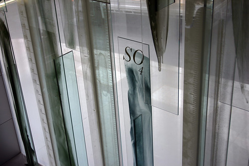
Janet Laurence 'water veil' artworks to communicate sense of peace and environment. Use real running water on top of artwork. References alchemy and science, perpetuating label identity of intellectual and historical.


No comments:
Post a Comment