http://www.behance.net/gallery/Drawing-and-Prints-2009/256704
31.3.11
MAXIMS SPEAK LOUDER THAN WORDS: Maxims I like (And the label likes)
Stop dreaming. Start doing.
Good artists copy, great artists steal.
In this day and age, everyone likes everything simple and easy (own idea)
We all have to be different in the same way (own idea)
Good artists copy, great artists steal.
In this day and age, everyone likes everything simple and easy (own idea)
We all have to be different in the same way (own idea)
Print promotion material: Nudie Jeans Co.
http://issuu.com/nudiejeans/docs/nudiejeans_collectionbook_ss11/6?mode=embed&layout=http%3A//skin.issuu.com/v/dark/layout.xml

Nudie Jeans Co. has really good print promotional material that infuses a sense of personality and heritage into their jeans. I chose to study their example because it is a relative newcomer to the market as opposed to levi's which has already become a sign brand.
Some notes:
-personalisation of their jeans, use of colloquial language and terms of endearment to describe the jeans as 'belonging'. Almost like a part of you. Befriending the jeans. Hangtags, booklets describing your product. 'The smell of a new pair of dry selvage jeans', 'mourn your worn out jeans'.
-displaying jeans, as a coveted item, an object worth admiration in a gallery or like a museum catalogue. As living art, shown and worn. Descriptions of details and seams to elevate their product to craftsmanship or each pair to be designed with love and care/. 'passionate about denim', 'dry' is highly sensual adjective, also used to describe alcohol. Taps into whats 'cool'. 'second skin' 'collectors edition', 'dedicated designers'. names countries, worldwide and international. 'fabric from Japan' uses places to signify exclusivity or exoticism. Or cosmopolitan. 'trims made exclusively for the range' 'skilled washers'
-product diagrams, sartorial jargon for the knowledgeable consumer, taps into the contemporary market of fashion aware customers and greater expectations for their products. The clothes are like a loyal friend. Close connection/forms bond with product. 'harvest cotton', 'indigo rope dyeing', 'shuttle loom'
-suitable graphic design. dds-simplicity. trendy graphics, references to literature. intelligent and current.
-locating the brand within society. i.e culturally aware. it is social, joins amnesty international to promote human rights.
-information on how they are made: transparency but also closer relationships. Sense of heritage and longevitity. Conveys the brand as a good investment.
-Strong philosophy=strong identity=greater bond.
-handwritten fonts is like personalisation. Which aims to break the sense of anonymity or machine production characterised by modernity.
-'the lab' appeals to guys and girls. Like the jeans are rooted in science, it is experimental, expressive yet,somehow correct and reliable, the product of knowledgeable people =trustworthy. 'selvage lab-vintage washes'
- similar jeans in a large range of colours. Again, consumers get a range of choices, percieved as value to get EXACTLY what suits them. But also feel specialised. Also for practical reasons, a quicker release of new items to keep it fresh, same design in different colours eliminates the need to come up with, test and produce new garments. Takes a pair of jeans they know have the right cuts and milks it for all its got.
-pages designed like a dictionary or index, illusion of order, variety and that it has everything you need.

29.3.11
Fashion Video inspiration: Vanessa Bruno
These videos provide inspiration to my own label. It is ethereal, feminine, contemporary quirky video style is self-reflexive. Use of diagetic sound via subject interacting with the camera and visual effects as the subject moves in rhythm to the music. Cutting and editing is used for effect.
This is the kind of video representing my label but with brighter colour like in the Antipodium video. Use contemporary upbeat/electronica music.
Positioning Statement
This picture perfectly captures what the label is about. So inspiring.
TINE is an edgy, contemporary womenswear ready-to-wear brand by Christine Pan. Targeted towards 24 year old women, it's aim is to create different yet coveted casual and businesswear garments whilst remaining commercially viable within Australia and hopefully internationally within 10 years time.
Forecast:
TINE the label is created to serve as a stand-alone brand 'to test the waters' with the intention to grow and become a multi-brand under the name of Christine Pan by which TINE will slowly become a diffusion label offering a similar aesthetic but to cheaper price points. Similar to Wayne by Wayne Cooper, the brand will be TINE by Christine Pan.
Adding value to the product: innovate and diversify. Unique products in fabric, colour and cut at a premium price. does not follow market trends but is mindful of its direction. Responds to contemporary fashion and in touch with the lives of its target market. Main aim is to revitilise sales. Initially uses available fabrics sourced within Australia, China and embellishments from India but differentiates through colour and cut. Plans to develop own unique fabric prints and finishes in the next 5 years to keep up with current technologies in textile product. Forward thinking.
Quality and eco-aware product: style, durability, comfort. colour-fast and eco-friendly dyes. Minimal waste-cutting. emphasis on exclusivity, sells small runs at higher price points. Targeted towards wealthy clients. Finishes must be durable during the fabric finishing process; stable in the presence of other chemicals; wash-fast; and evenly and consistently applied. Finishes also need to be financially feasible and environmentally friendly. Leathers, silks, natural fibres, synthetics.
Business side: eliminate the middle-man. No sweatshop workers, fair pay workers. Better conditions for workers.
Advertising: web, print. word of mouth.
References: To convey a sense of heritage longevity, imagery from vin
Personality: humble. modest about it's own talents. no pressure to conform but doesn't scream individuality or difference for the sake of being different. It is balanced and suitable. It has attention to detail, conceptual undertones, self-aware and is commanding because of it.
Analyse and explore personal brand.
What kinds of design are you interested in pursuing and why? Womenswear and menswear. Initially womenswear with plans to move into menswear to potentially develop it in equal parts. Why? There is much scope for design in both mens and womenswear. It will become a fully fledged brand but grown organically. Perhaps will show at runways but prefer to develop it outside the public sphere. Want to look to brands like Country Road or Antipodium which was built on their current customer base, clothes which addressed the needs of their target market and clever marketing.
28.3.11
27.3.11
Name
aris
christine pan
lee finch
oliver henson
unison
misnomer
c / pan
c.j.pan
c.j.p
c.pan
Christine P
tine (Chris-tine/deer antlers, Y shape)
tine (taɪn) ![[Click for IPA pronunciation guide]](http://sp.dictionary.com/dictstatic/g/d/dictionary_questionbutton_default.gif) | |
| — n | |
| 1. | a slender prong, esp of a fork |
| 2. | any of the sharp terminal branches of a deer's antler |
22.3.11
Logo development: concept statement
please click open to have a closer look at the logos.
Plan for the layout of the book. Simple. Use the thin grey line.
Agh! I had the name akris, but I found out a week later it was already taken!
29.3.11
the good logos
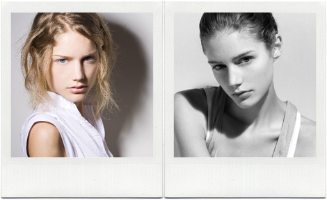
'tine' doesn't look half bad, I was worried it was too simple but its modern, simple and commanding. I was thinking of using deer antlers as a homage to its meaning. I like how the word is not commonly known yet is a nice imagery.
this model's name is Tine Maertens
deer antlers
http://www.istockphoto.com/stock-photo-5754746-deer-antlers-isolated-on-white-background.php
http://animalmakers.com/Catalog/images/deer_1677-01.jpg
- Must be scalable
- Must work in colour and mono
- Must be vector based (create crisp outlines with limited colors)
- Should be adaptability and able to be reproduced in a variety of
contexts
- Should be memorable and unique (set you apart from the
competition)
- Should have relevance to your industry
- Should appeal to your target market
I finally settled on using the name 'Tine' because its simple and different, a part of my name so it has 'heritage' but also it has a double meaning of the prong on antler's horns. It gives the label a sustaining imagery and common thread linking all the products. The antlers horns can become a subsidiary logo on all promotional products as well as garment prints. It kinda relates to nature as well as strength, symmetry and consistence.
The logo font is chosen to be simple and modern. It's san serif and slender to reflect the label's minimalist design philosophy. It also keeps it current, contemporary and streamlined for easy recognition. The font is structurally balanced, strong and dependable, therefore being perceived as long-lasting and stable. The letters T I N E is actually make up entirely of horizontal and vertical lines, there is potential for something quirky to be done experimented with. The sleek, elegant and post-modernist simplicity engages the customer as a no-fuss brand, non-trend focused with designs which will remain coveted for a long time.
The logo colour is black because its standard and stark. It has good contrast with the white background and will scale well for a variety of products. It remains consistent with crisp outlines and easily recognisable for my target market.
The font chosen helps define the identity and personality of the fashion label, giving a unique visual voice that adds strength to the company.
The font chosen helps define the identity and personality of the fashion label, giving a unique visual voice that adds strength to the company.
The Label Picture
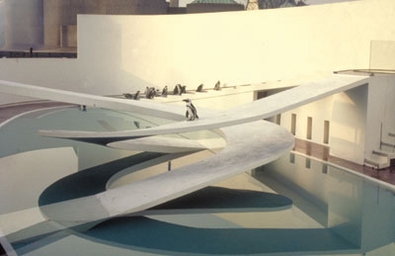
Label Ethos/Inspiration : 1934 The Penguin Pool, London Zoo*
Architect: Berthold Lubetkin
Engineer:Sir Ove Arup (1895-1988)
Marrying structural engineering and architecture - "total architecture" as he put it - Sir Ove had already built his famous penguin pool at London Zoo and the new Coventry Cathedral.
In his own words: "Unless we have a ‘mission' - and I don't like the word - but something ‘higher' to strive for - and I don't particularly like that expression either - but unless we feel that we have a special contribution to make which our very size and diversity and whole outlook can help to achieve, I for one am not interested." From the Key Speech
Read more: http://www.building.co.uk/1960s-building-hall-of-fame/3069488.article#ixzz1HJAsmnVW
Image from: https://blogger.googleusercontent.com/img/b/R29vZ2xl/AVvXsEhzWF2W9OUa9uvOaeuOWYtNhkWfoC0Hx9MHQQZvXq69WaK4syedqEKiniT6qrIXXQulwMGXcMm044oeVpQp2XlXAZfYgN-9ZY63jO0LglydMC3grxcFuLRyyr925FaeN7qMlt35-b_IbUY/s1600/Berthold+Lubetkin,+Penguin+Pool,+London+Zoo,+1934.jpg
Label Colour: Pale Yellow + Monochrome
It is:
-a subtle sweet burst of sunshine
-suggests intellect, logical imagination, social energy, organisation, honour, loyalty, clarity, understanding, mellowness, confidence, wisdom, weakness, curiosity (from http://www.sibagraphics.com/colour.php)
-calm, cheerful, moderated, joyous
It is:
-a subtle sweet burst of sunshine
-suggests intellect, logical imagination, social energy, organisation, honour, loyalty, clarity, understanding, mellowness, confidence, wisdom, weakness, curiosity (from http://www.sibagraphics.com/colour.php)
-calm, cheerful, moderated, joyous
Words+objects describing essence of Label
 london zoo
all the following words describe the label identity, values, and ethos.


http://architecouture.files.wordpress.com/2008/12/angle6.jpg?w=604&h=576
le corbusier's writing
Intelligent, social, sensitive, creative, architects

I can see the skyscraper: a slender, floating construction on its broad pediment, noble and delicate in its lines, whose white and gray sets itse;f apart from the blue sky. Strong and safe in its assembly, it matches a natural mountain for strength.
Ten thousand people daily flow in and out of it: little office girls, emerging from the tight courtyards of the north of the city, quick tick of heels, black leather handbags swinging, filling elevators, shooting upward like a swarm of swallows.
Men striding out, purpose in their eyes, enterprise in their loose limbs; machine rattle and clatter of conveyances; shouted order of command; the even beat of mechanical perplexity, working towards a common end.
And up above God is disturbed in his everlasting tranquility, compelled to take an interest in our tiny destinites.
Joseph Roth, 'Skyscrapers' (1922)"
http://nastybrutalistandshort.blogspot.com/2006_07_01_archive.html
"I had always imagined London Zoo as a rather dilapidated, forlorn place. Its image in my head was that of a sodden Withnail barkingHamlet at an oblivious cage full of leopards. So I thought this would be a fun place to spend my birthday. Which it was, but not quite in the sense I had imagined.
Naturally, the architecture of the place was part of the reason, as well as the eulogy to it as 'well worth a boggle' in Nairn's London. Also the preposterousness of placing all manner of tropical animals not only in London, but in the traffic blackened, smackhead ridden, portugese goth frequented pit that is Camden. Imagine my surprise then to find what one would suspect to be a rather furtive affair, was in fact enormously upfront with its conservationalist credentials, with swish new enclosures to mask the obvious fact that giraffes are not supposed to live in Camden. Many of the architectural flights of fancy were still impressive- the constructivist aviary (unusually shy birds, though, particularly compared with the surrounding pigeons) and the concrete camel ziggurats. A tent filled with butterflies was nicely surreal. But the fate of the penguin pool was somewhat unexpected.
Presumably for reasons of alliteration it is now a Porcupine Pool, the water replaced by woodchip with a solitary porcupine slumped miserably under Tecton's swooping boards. Apparently the Penguins were not breeding. The Penguin Pool has always been a wonderful modernist archetype, the aquatic gleaming futurism spawning a hundred lidos- so to see it like this was peculiar to say the least. And what this implies of the libidinal economy of modernism is more than a little worrying..."
http://nastybrutalistandshort.blogspot.com/2006_07_01_archive.html


forward thinking, historical


http://www.spektrumcollective.net/tag/typography/
graphics, visual, different

simple, informative, clean, bare, essential, austere

Japanese architect Norisada Maeda Atelier. His ultra modern home
home> extension of the self, clothes for living, personal and intimate

Stephen Wiltshire has an amazing story behind him. He was born mute and did not relate to other human beings for the first few years of his life. He was diagnosed as autistic at the age of 3 and lived entirely in his own world. At the age of 9 he uttered his first word and that word was paper. Having a near photographic memory has allowed him to draw some amazing cityscapes. His art has a whimsical line to it and contains a large amount of intricate pen work.
http://www.spektrumcollective.net/category/art/
compassionate

Contemporary Art, supporting local sweet talent
-metamorphous, ephemeral, intangible, transparent
http://techniker.oi-dev.org/blog/view/pattern-place-purpose-proctor-and-matthews-architects

structure, order, composed, form and function. authentic and authoritative.
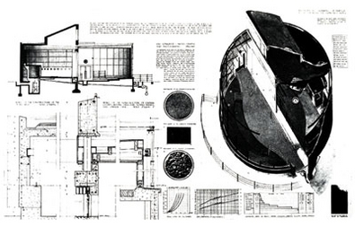

maps/architectural plans/instructional diagrams: logical, fitting, visceral, directional
cool, creatives
creative, surprising, low key, minimalist, quirky
Subscribe to:
Comments (Atom)






 This is what I was afraid of.


