please click open to have a closer look at the logos.
Plan for the layout of the book. Simple. Use the thin grey line.
Agh! I had the name akris, but I found out a week later it was already taken!
29.3.11
the good logos
'tine' doesn't look half bad, I was worried it was too simple but its modern, simple and commanding. I was thinking of using deer antlers as a homage to its meaning. I like how the word is not commonly known yet is a nice imagery.
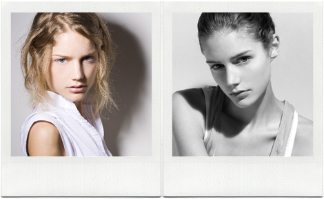
this model's name is Tine Maertens
deer antlers
http://www.istockphoto.com/stock-photo-5754746-deer-antlers-isolated-on-white-background.php
http://animalmakers.com/Catalog/images/deer_1677-01.jpg
- Must be scalable
- Must work in colour and mono
- Must be vector based (create crisp outlines with limited colors)
- Should be adaptability and able to be reproduced in a variety of
contexts
- Should be memorable and unique (set you apart from the
competition)
- Should have relevance to your industry
- Should appeal to your target market
I finally settled on using the name 'Tine' because its simple and different, a part of my name so it has 'heritage' but also it has a double meaning of the prong on antler's horns. It gives the label a sustaining imagery and common thread linking all the products. The antlers horns can become a subsidiary logo on all promotional products as well as garment prints. It kinda relates to nature as well as strength, symmetry and consistence.
The logo font is chosen to be simple and modern. It's san serif and slender to reflect the label's minimalist design philosophy. It also keeps it current, contemporary and streamlined for easy recognition. The font is structurally balanced, strong and dependable, therefore being perceived as long-lasting and stable. The letters T I N E is actually make up entirely of horizontal and vertical lines, there is potential for something quirky to be done experimented with. The sleek, elegant and post-modernist simplicity engages the customer as a no-fuss brand, non-trend focused with designs which will remain coveted for a long time.
The logo colour is black because its standard and stark. It has good contrast with the white background and will scale well for a variety of products. It remains consistent with crisp outlines and easily recognisable for my target market.
The font chosen helps define the identity and personality of the fashion label, giving a unique visual voice that adds strength to the company.
The font chosen helps define the identity and personality of the fashion label, giving a unique visual voice that adds strength to the company.


 This is what I was afraid of.


No comments:
Post a Comment